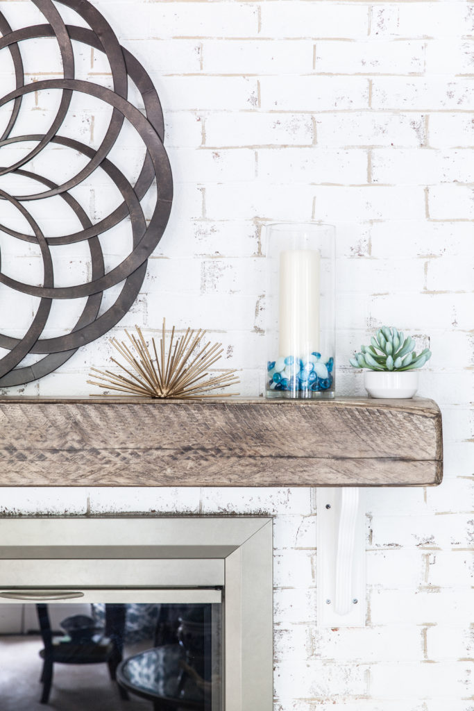
 If you’ve been with us from the beginning then you know we partnered with Trove Market and Bear Wood Company to design a custom reclaimed wood mantel that was antiqued.
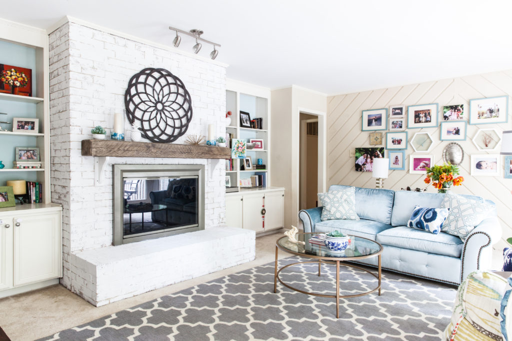
We’re excited to be featured today on Trove sharing our 5 month design process on finding the right company to make this mantel a reality! You can check out the details of the feature here.

If you’re just joining us you can get caught up here with our 6 week design challenge process:
Week 1| Week 2 | Week 3 | Week 4 | Week 5 | Week 6
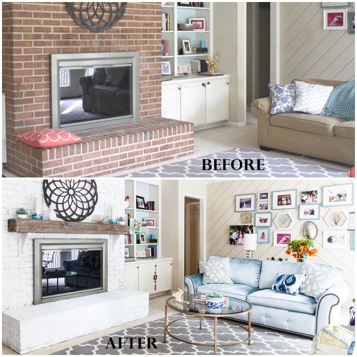
In Week 6 we revealed our family room refresh and a few before photos. However we wanted to share more before and after comparisons today for you to really get the full transformation and impact that this mantel had on the entire room!
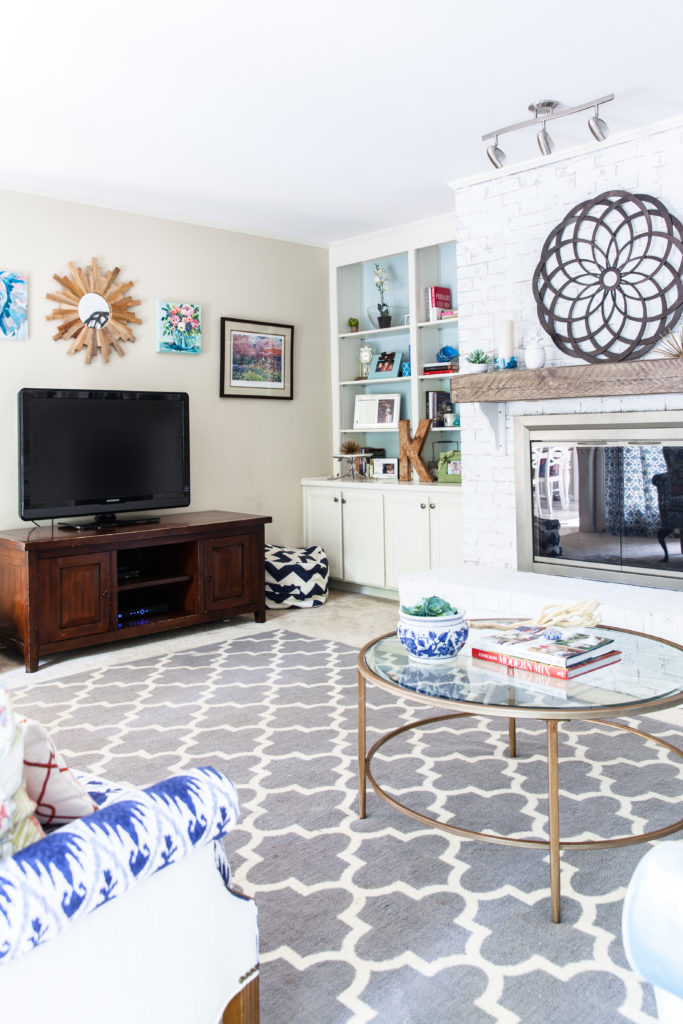
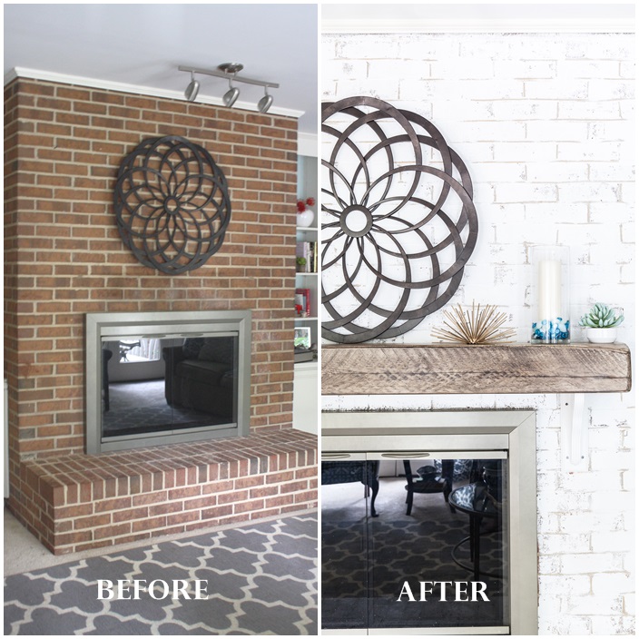 Simply painting the red brick fireplace white before installing the mantel was the first step to making this room bright and updated. The only regret is not doing it sooner!
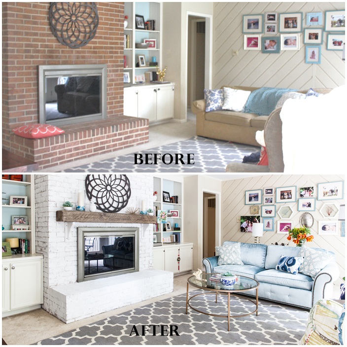 I had my heart set on a reclaimed mantel and having a custom piece designed ever since we moved into this home 3 years ago. When Trove contacted me back in November to collaborate with them, I knew this mantel would be a great fit for us both. However, I almost had given up after our 5 month planning process until Mason with Trove connecting me with Bear Wood Company a few weeks before my 5th One Room Challenge started!
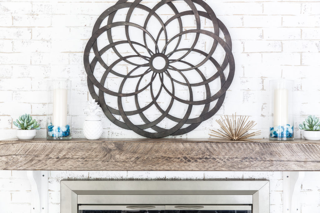
Ever since we moved into our home 3 years ago I’ve wanted a reclaimed wood mantel and thanks to Trove and Matt with Bear Wood Company we finally have one!
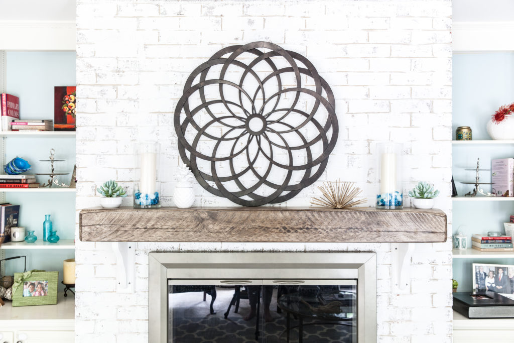
Here’s another before and after view as you walk into the family room from our front entryway. The fireplace and built in shelves are on your right and we have an entire wall of floor length windows and doors, which brings in so much natural light and is one of the reasons we bought this house! {If you want to see the before family room when we moved in, before it was the “before” below and see how this wall of windows was covered up by floor length 70’s style blinds go here. }
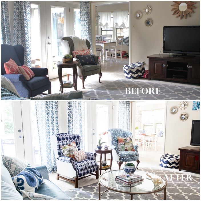 Our family room opens up into our kitchen, which also has lots of natural light with all the windows. We love the flow, but in our dream home we’d love to have the kitchen completely open to the family room as we love to entertain.
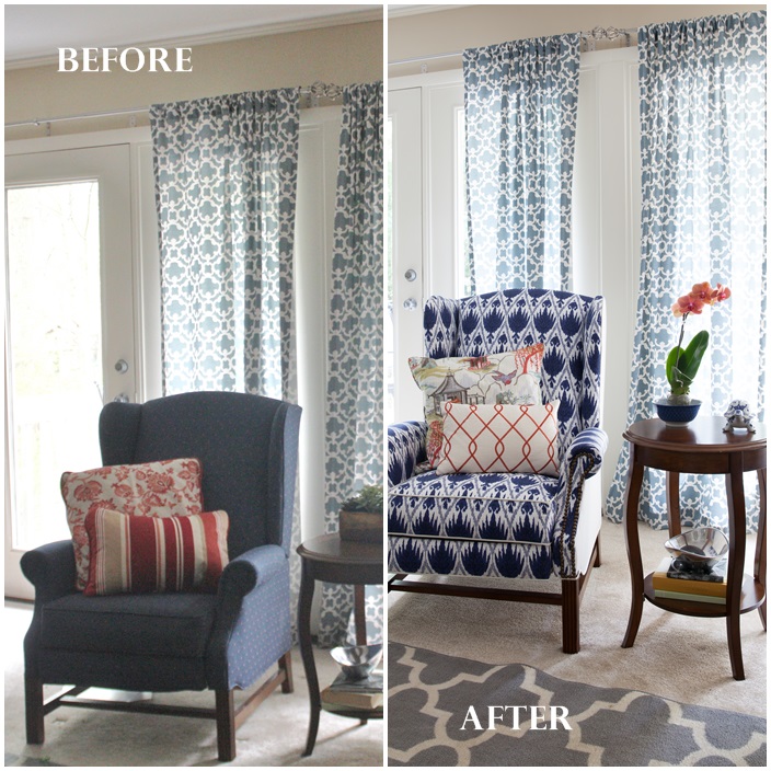 Of course the custom antique wood mantel isn’t the only major transformation in this coastal family room refresh! This recliner was a hand me down from my parents after they updated their family room years ago. It’s been a great piece to have in our home because it’s doesn’t look like your average recliner but functions as one. However, the fabric wasn’t my style and out dated. What a difference custom fabric makes and willingness to be BOLD with the two toned fabric!
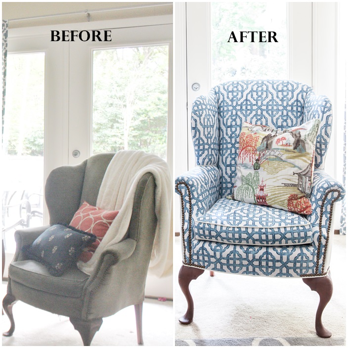 This wingback chair transformation is the second piece of furniture we had re-upholstered in New South Home designer fabric! I inherited this chair when my grandparents died and loved the blue/grey velvet and nail head trim on the bottom and around the arms.
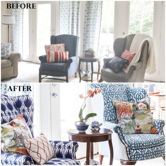
However, the fabric had seen better days with tears at the bottom and aging spots on the velvet. I wanted to keep the nailhead trim on this piece and added nailhead trim to the other arm chair and sofa to coordinate.
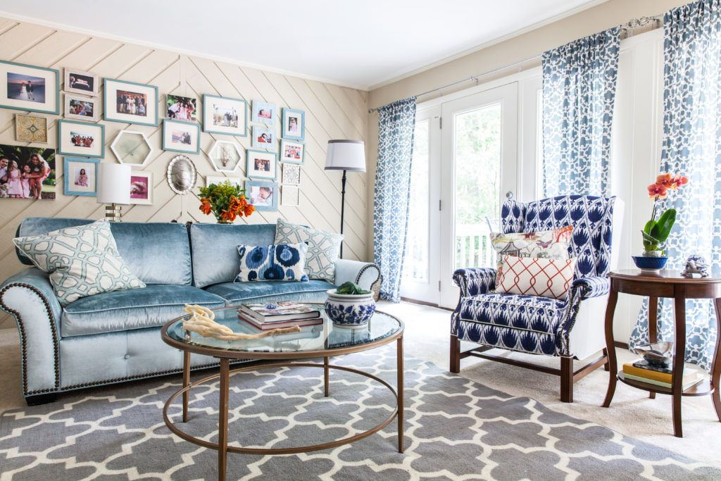
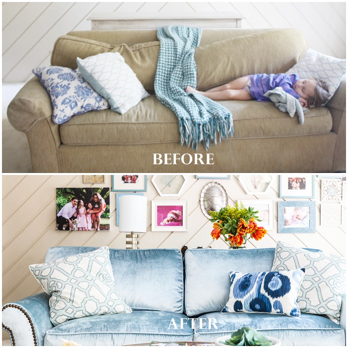 This Crate & Barrel sleeper sofa is 16 years old and was one of my first pieces of furniture when I graduated Davidson College and started working on Capital Hill! It has been with me through 7 moves, 4 states, 1 fur baby named Bailey, and two little girls. Needless to say it has been loved and wins for the biggest transformation in this room!
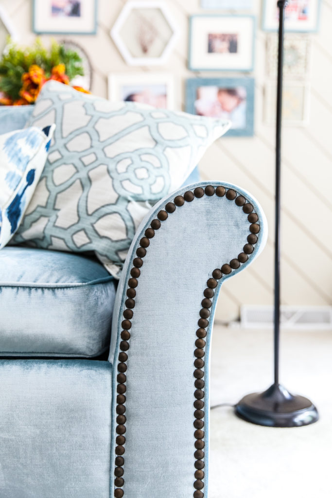 Here’s a detailed shot of the nailhead that I had Baity’s Custom Upholstery add along those huge round arms to coordinate with the arm chairs. Worth the wait and heavy lifting for this beauty!
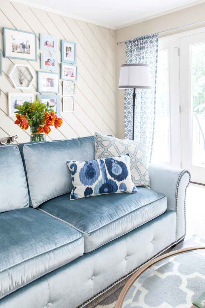 Nailhead trim was also added to the bottom along with buttons to create a tufted look. In Week 1 I talked about swooning over a blue velvet tufted sofa or purchasing a sectional. I loved the grey/blue velvet from the wingback chair and decided to be daring and use this Velvet Shimmer Aqua fabric from New South Home on sleeper sofa!
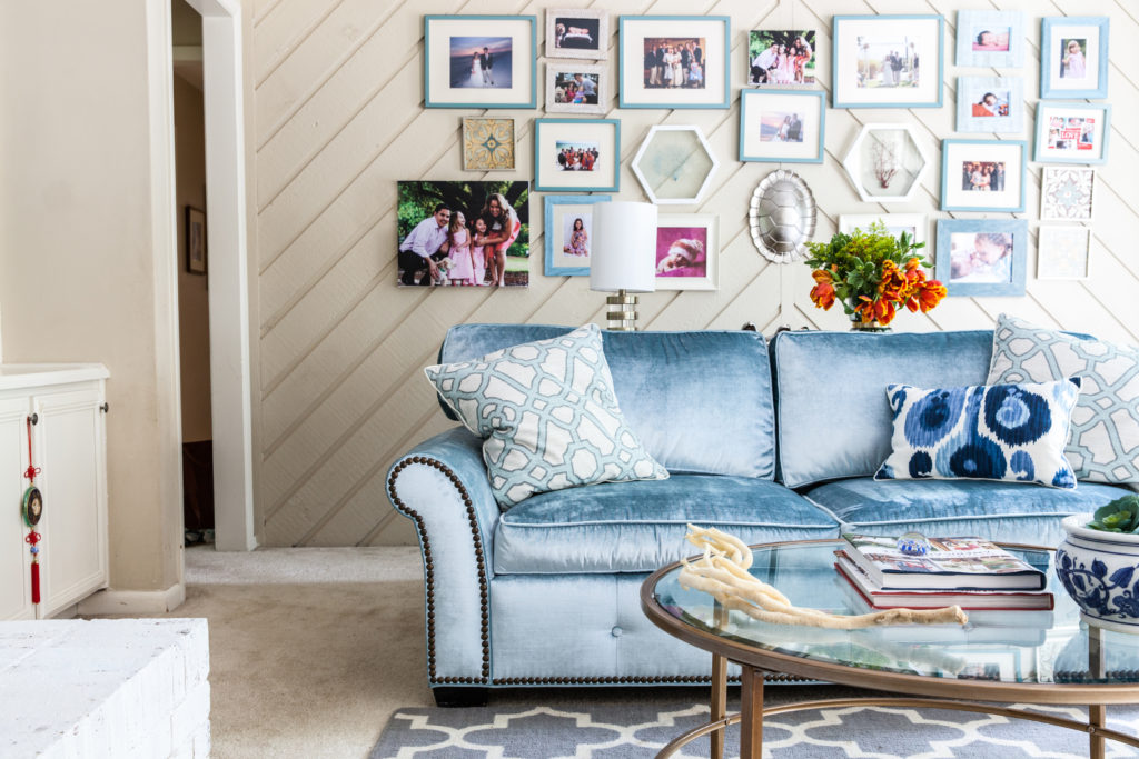
Another reason we went with this piece was our girls love movie night and pulling out this sleeper sofa into a full bed, getting their sleeping bags out, and watching a movie as a family. After much debate and the realization that due to it being a sleeper sofa we could not have this sofa tufted on the back (adding padding on back to have it tufted would interfere with sofa being able to open and close and hold the mattress) we decided to GO FOR IT!
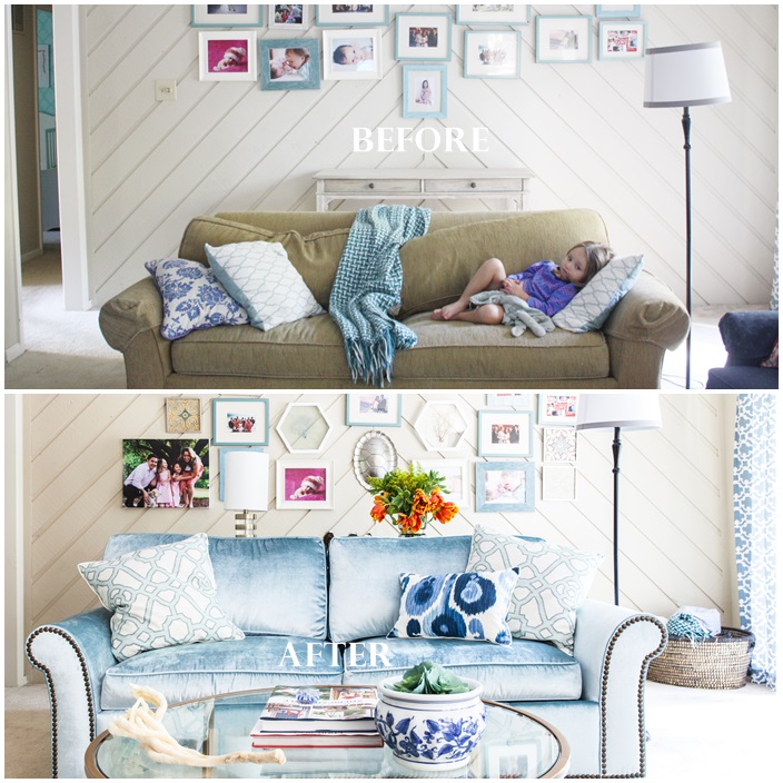
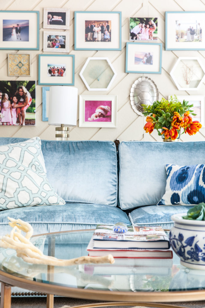
Truly a night and day difference between the worn out and blah neutral colored sofa and this plush, chic and stylish velvet custom sofa!
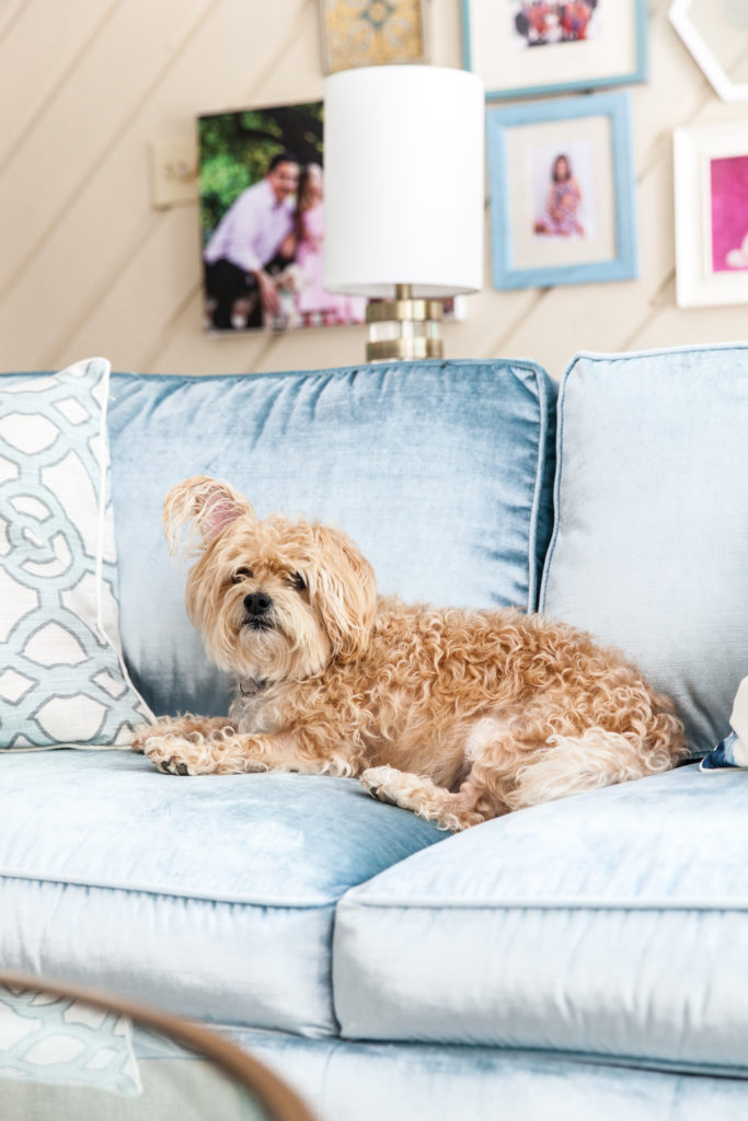
Even our first born boy Bailey couldn’t wait to get comfortable on this new and improved sofa!
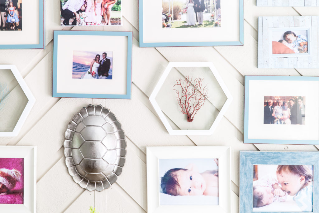
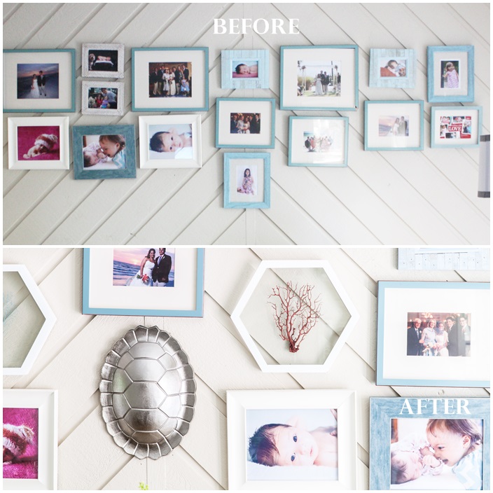 Another before and after transformation is the gallery wall behind the sofa. We moved into this home 4 weeks before our 2nd daughter, Charlotte was born. In the mad rush to get everything organized before she made her debut, I hastily installed this gallery wall with our family photos. I’ve been wanting to re-design it with coastal décor, updated photos, and canvas wall art for some time and finally had that opportunity with the Family Room Refresh!
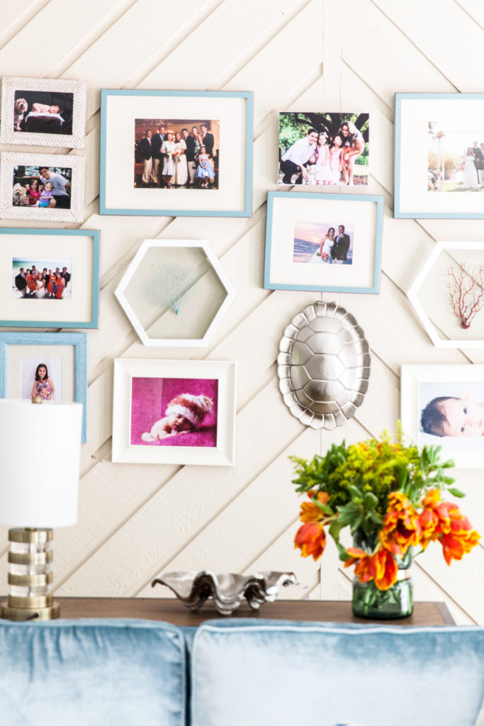
I had intended for the 3 commissioned art pieces by Christenberry Collection to be part of this wall gallery. However, more times than not when you start styling a space you have to adjust your original design. I love the 3 art paintings so much that they really need to be showcased rather than blend in with the gallery wall, which is why I decided to finish the opposite wall with 2 of the 3 paintings and hang the 3rd painting on the built in shelves.
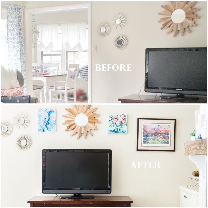
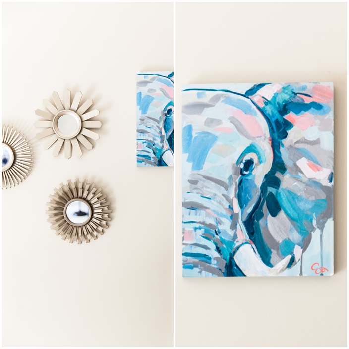 I’m not sure when my love of elephants started, but it steamed from my travels and my grandfather Sam’s safaris in Kenya. I’ve always wanted a painting that represented my style and elephants in this room. The painting of Sam the elephant by Shields Cantone is beyond perfect and so meaningful to me!
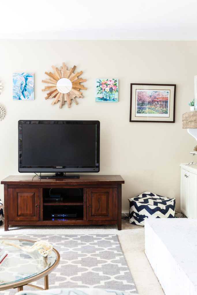 I’ve always loved the impressionist movement and Claude Monet is my favorite artist! I’ve had this signed Max Agostini print, who studied under Monet, hung for a few years but needed something else to balance out this wall. The floral painting by Shields Cantone via Christenberry Collection is the perfect fit with the painting of Sam the elephant!
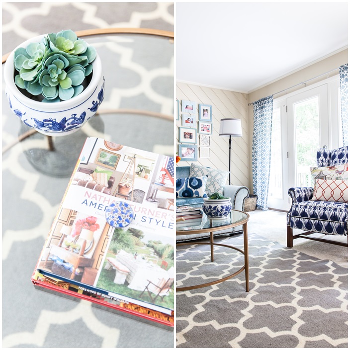
 The last part of this transformation is finally getting a new round coffee table and console table behind the sofa. Again, round coffee table has been on my check list and this gold antiqued round coffee table with the glass top fits perfectly in this space! While it is bigger than I had intended, the glass top and open bottom enlargers the space.
You can catch the before details of our partnership with Trove on this family room refresh here, which include other sources for table consoles and coffee tables.
Here are our other ORC’s room’s:


Big Girl Room #2 Coral and Robins Egg Blue (which was updated in January with a big girl bed and new bedding that I still need to post)

Make sure you’re following us on Instagram and Pinterest for more home décor and party ideas! We’ll be collaborating with some of our favorite designers from this ORC to give you inspiration next month so stay tuned!
Credits and Sources
Design, Styling, DIY, floral arrangements and before photography – Sarah Sofia Prodcutions
Photography – Laura Sumrak
Velvet Shimmer Aqua fabric on sofa, custom pillows, and cream linen fabric on back of chairs – New South Home
Custom antiqued wood mantel – Bear Wood Company via Trove
Curated art – Christenberry Collection by artist Shields Catone
Upholstery – Baity’s Custom Upholstery
Canvas prints – Shutterfly
Fabric on front of arm chairs – Lacefield
Coffee table – Wayfair by Birch Lane
Console Table – Overstock
Lamp on console table, coral wall art, and glass container – HomeGoods
Tortoise shell wall art, blue and gold vase on console table, silver sea shell, and white pineapple candle – Target
Hand painted tile – Ballard Designs
Fireplace paint color – Extra White Sherwin Williams 7006

Sarah you are amazing! You made so many careful executed decisions for this room and I love the pattern play within the blue & white color scheme and the fireplace makeover! What a difference those elements made to this space! I hope you and your beautiful family are enjoying your refreshed room and gorgeous new mantle!
Hey Lisa, many thanks for your kind words and for always being one of biggest cheerleaders! You’re fireplace and built in shelves inspired me! Cheers to yet another ORC under our belts! XOXO, Sarah